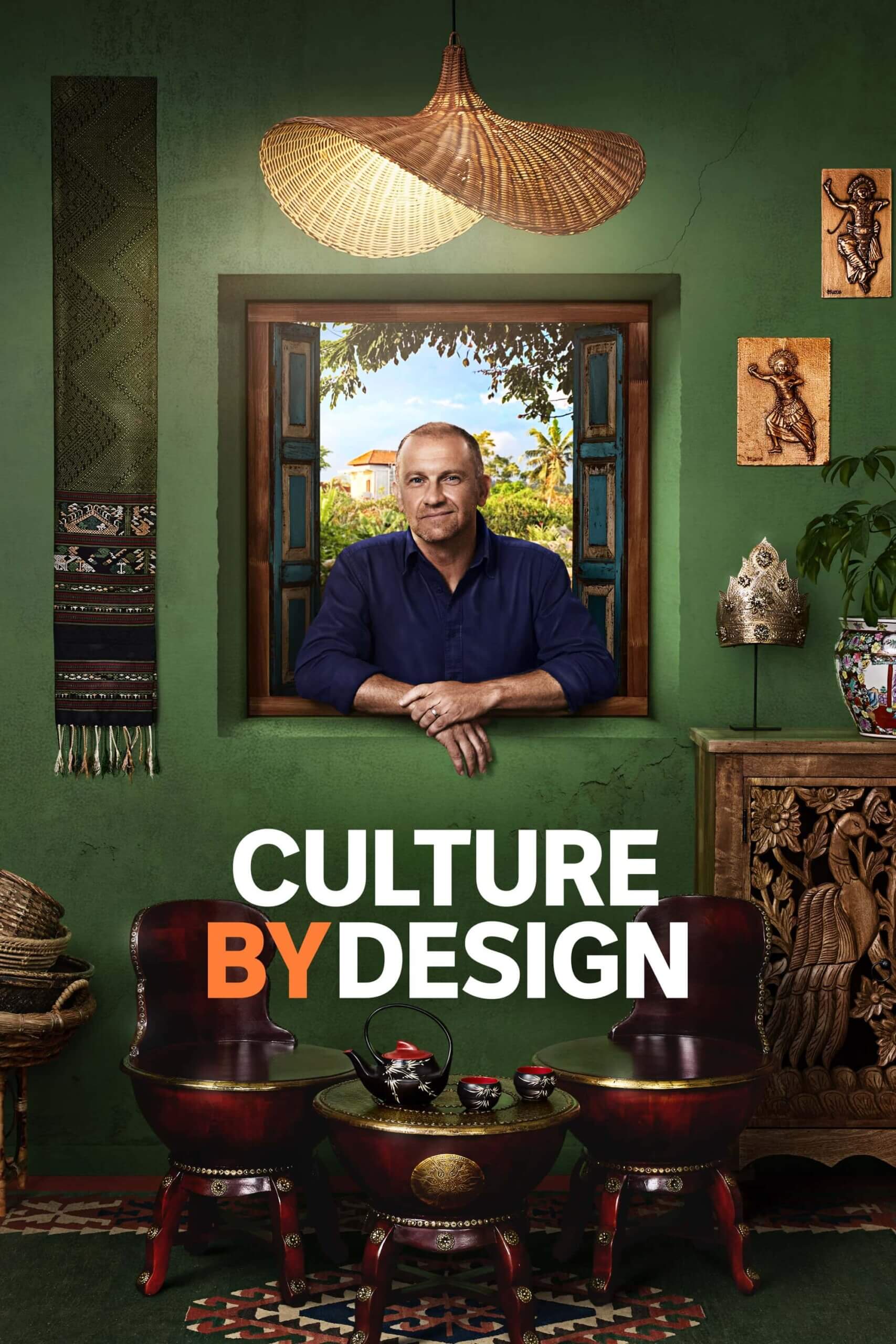
The brief called for distinctive key art for ABC’s Culture by Design, a six-part series exploring innovative design and craftsmanship across the Asia-Pacific. Without an on-location shoot, I developed a conceptual, art-directed solution that would distinguish the series from conventional factual and lifestyle programming. Framed at a window, Anthony stands at the threshold between a lush landscape outside and a vibrant interior layered with traditional and contemporary design objects. His position reflects the spirit of the series: a curious traveller encountering the creativity, culture and craftsmanship of the region, and inviting audiences to discover it with him. The final concept was designed to evoke travel, cultural exchange and discovery, appealing to audiences interested in art, interiors, architecture and craftsmanship.

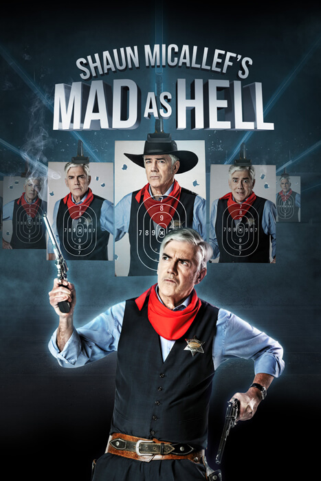
For the final season of Mad As Hell, a political satire show, I developed a key art concept that addressed several elements. The source material consisted of individual photos of Shaun Micallef in a cowboy outfit. I leveraged this imagery to create a commentary on gun culture, while also capturing the show’s signature zaniness. The concept paid homage to previous seasons’ key art by featuring multiple Shauns, reminiscent of Agent Smith from The Matrix.
Delivering fluid animation within a ruthless 150kB file size limit is a delicate balancing act. This is not a video but actual PNG and jpeg images animated with JavaScript. For each puppet design one file was created and built Responsive to the various sizes: MREC, Leaderboard, Billboard and Half Page. This was more efficient and ensured that any changes made to the animation would reflect across all sizes. I also made parallax MREC versions.
Animation blocked.
Please pause your ad-blocker to view the live HTML5 creative.
Animation blocked.
Please pause your ad-blocker to view the live HTML5 creative.
Animation blocked.
Please pause your ad-blocker to view the live HTML5 creative.
Working within the restrictive 150kB limit for HTML5 display ads requires strict technical discipline. I developed the creative concept through to finished art and what you see here are only PNG and jpeg images animated with JavaScript. I studied videos of rising bubbles in order to mimic the effect to ensure the physics felt natural without relying on a heavy video file.
Animation blocked.
Please pause your ad-blocker to view the live HTML5 creative.
Animation blocked.
Please pause your ad-blocker to view the live HTML5 creative.
Animation blocked.
Please pause your ad-blocker to view the live HTML5 creative.
Animation blocked.
Please pause your ad-blocker to view the live HTML5 creative.
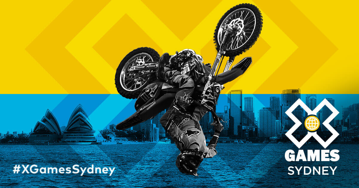
I cut this together in Premiere Pro, creating effects, overlays, a simple animated X Games logo sting (seen at the end), and writing copy. Only interview and skating iPhone footage and some other video montages were provided. I also carried this pulsing ‘x’ motif through to the other social ads pictured here.
Sidenote: Didn’t end up going live as the media agency’s relationship with the client dissolved in the middle of approvals.
I was responsible for the entire brand identity, logo, responsive website design and build, interior design, and marketing material. Image effect on student images was manually created using Photoshop.
I came up with this simple cinemagraph concept last minute to promote White Wing’s new range on social, when the media agency discovered they only had rights to static images of the cake pieces on and off the plate, and no more budget to take new photos or videos. I requested the product package as a separate static file which I photoshopped to look like it was opening with pieces leaving the pack, and created this video.
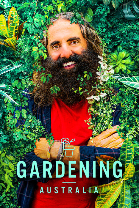
For past seasons of Gardening Australia, the show used basic cast photos with a logo overlay. I tackled the challenge of being supplied uninspiring, brown-toned and non-professional photos of Costa Georgiadis, developing a more dynamic concept combining it with stock vegetation imagery. My goal was to create a hyperrealistic image where Costa appeared truly immersed in nature, almost as if he were becoming one with it. However, to maintain the show’s lifestyle genre, I kept his casual clothes visible and highlighted the natural textures around him. The producers were thrilled with the final result!
This was created back in 2009 when it was more difficult to achieve cool text effects without the plethora of stock images and Photoshop actions that are available now. I used a photo of a tree to create the steam effect and the streaks were painted in Photoshop.
I'm Ann Hoang, a designer and coder with 20 years' experience, currently working with a brilliant in-house team ABC Made, the ABC's internal creative agency. I hold a four-year degree from The University of Sydney, with majors in Philosophy, Information Systems, and Film Studies.
When I'm not designing, I'm usually contemplating the meaning of life – or living out my own Hero's Journey.
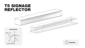
These technical illustrations were drawn from observing and measuring light fixtures. Some drawings were used to register design patents.
Circa 2006
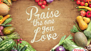
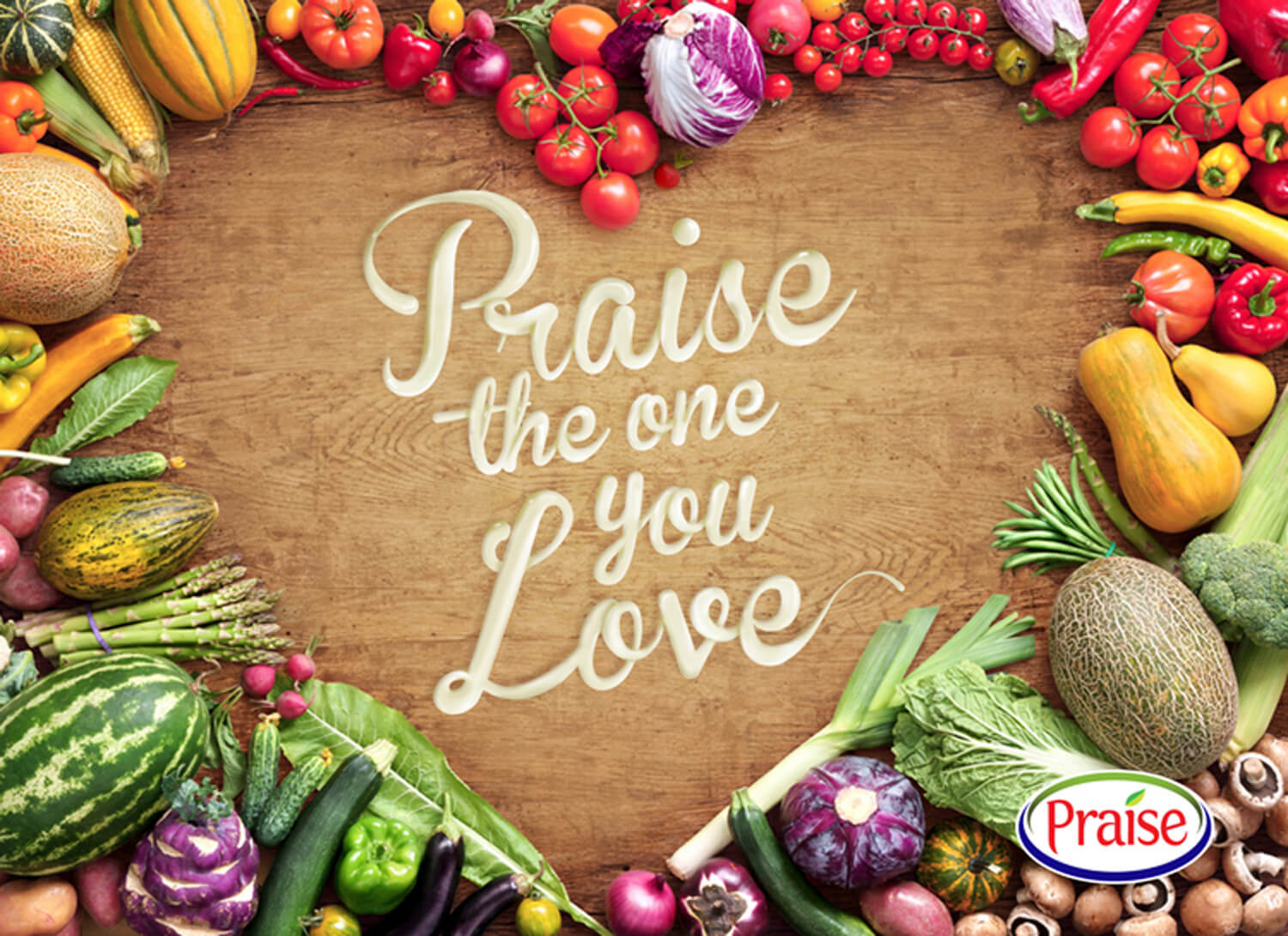
I was briefed to do a quick image with ‘the words written in mayonnaise’ for their Facebook page to celebrate Valentine’s Day. I sourced the stock image, used Illustrator to set the typography and manually painted the effect in Photoshop.
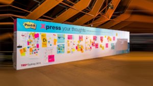
The brief was to theme a 12 metre wall for Post-It at TEDxSydney. I suggested we repeat the ‘x’ to make the partnership more seamless between Post-It and the event so attendees would engage with the stand more if they perceived it as part of the event rather than just an ad. This inspired the words ‘Xpress’, ‘Xploding’, and ‘Xploring’ from our event coordinator.
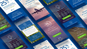
This responsive web design and customised icon suite was created for a digital design class project. I wrote some copy and sourced the imagery as only the logo, typeface, and corporate colours were supplied.
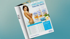
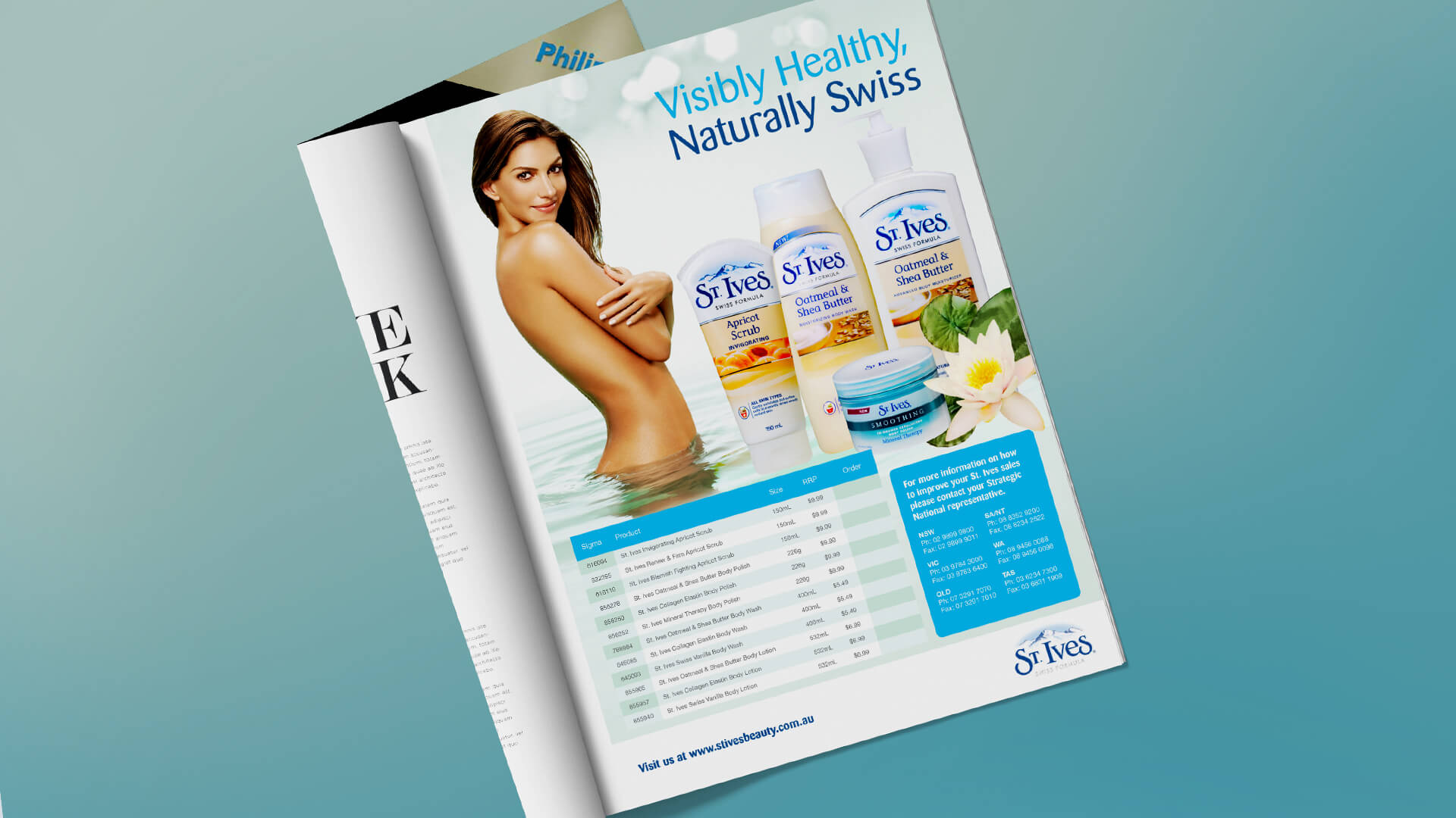
Complete layout design with no previous advertisement reference guide. I created the table styling, product shot arrangement, and typography.
Circa 2008
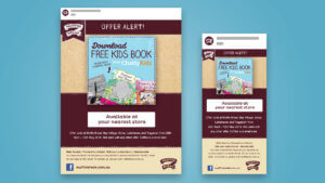
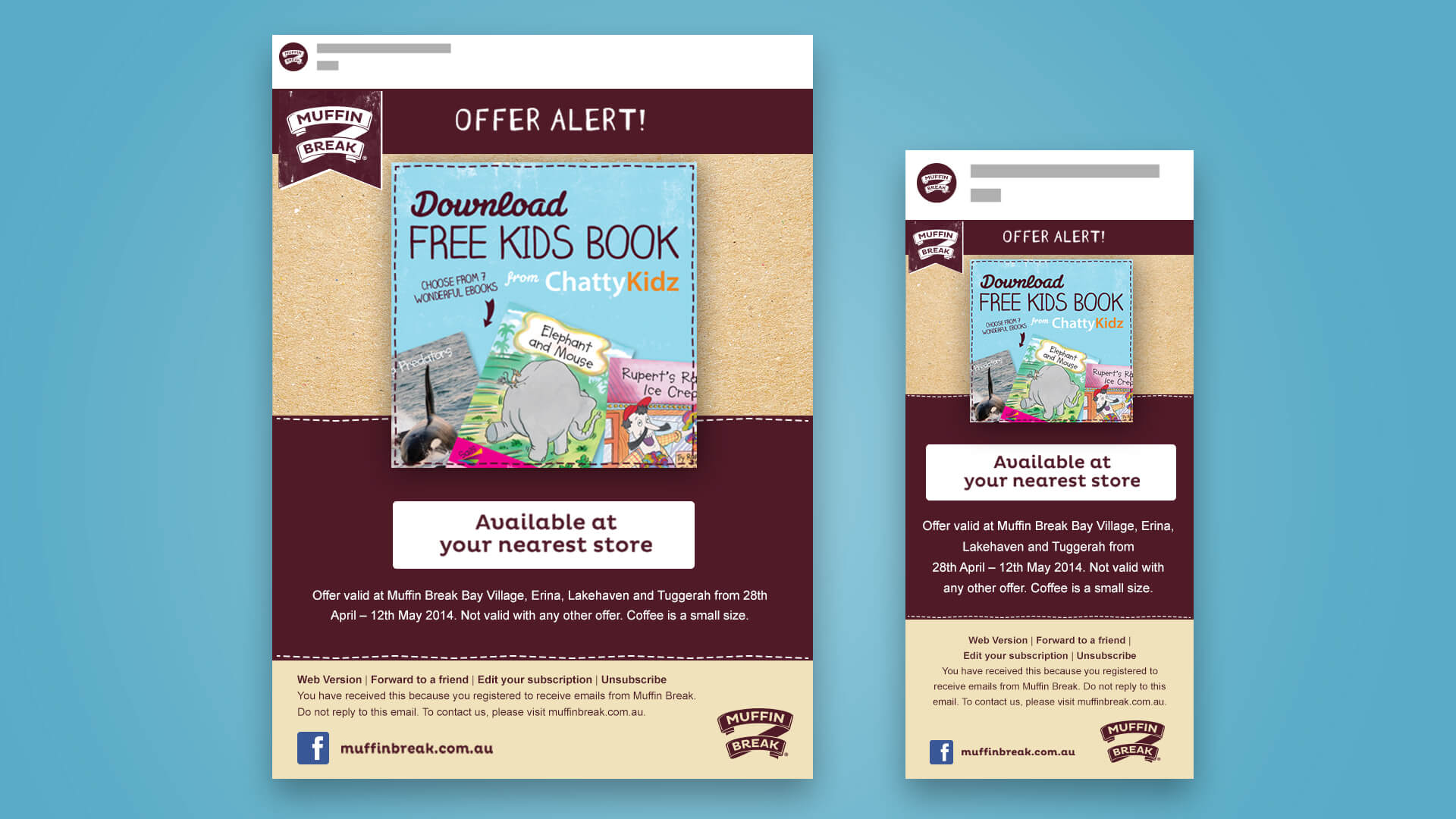
Designed an email template for desktop and mobile where a campaign offer image could be easily swapped out for subsequent future campaign offers. Their Facebook post image could be reused in this space to minimise having to create another asset for email.
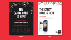
They required posters, cart branding, and t-shirt designs to launch their new mobile app internally to staff. Originally, I designed candy icons to match each new app feature with a candy they were handing out. Eventually however, we had to stick to their strict poster design template.